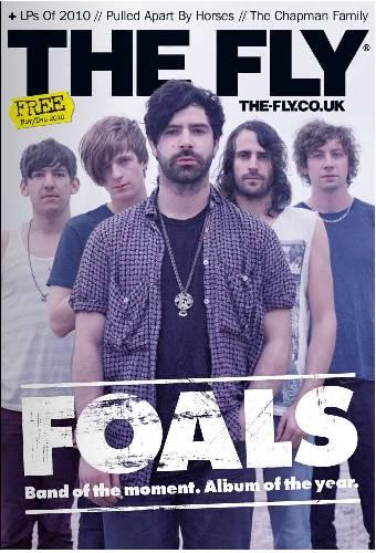
This is a very simplistic flatplan and I've based it from this image:
The Fly is a British Indie mag like my own and they were relatively popular. I feel as if the simplicity and minimalism is aesthetically pleasing and I could base my magazine around it.
This flatplan appeals to me because of the minimalism. I think it would stand out from its competitors because of its simple approach. It would look different clean amongst it's competitors crowded pages that are over-stuffed with content. I'm going to have the background white like done with The Fly (to further my attempt at minimalism.) The fonts I use will emphasise the minimalistic approach and they will be simple.


No comments:
Post a Comment