Showing posts with label Flat-plans and Rationales. Show all posts

Monday, 23 January 2017

Contents Page Flatplan FINAL REVISION

 I have decided to make one last change based on the feedback I received and fill the page completely by altering some things. This is the last change I will make to my flatplan.
The page number in the top left corner corresponds with the placement of the page number on my DPS. Thus helps the pages work together as a whole instead of as three individual pieces of coursework. 
The bars behind the title create visual excitement and appeals to the teen audience through this excitement.
The main image is still the focus on this page and will be edited to fit the red colour scheme still. The features section will be placed to the side of the image.
This is the place where it will be easiest to read, which means that the page functions as it should.
The editors note and competition title (which may not end up being about the competition if I decide that having the subscription information looks better) will be used to make the page look more full and add a personal touch to the page. 

Thursday, 19 January 2017

Front Page Flatplan FINAL REVISION


I am confident that I do not want to make anymore changes to this flatplan. It is full of conventions now and the page should be filled completely if I use this layout. This should solve the 'bland' problem I've been having. This incorporates a range of shapes in different sizes that will make the page look visually exciting and draw in attention.
It still takes heavy inspiration from this magazine but there have been a lot of additions. 

Listing band names across the top draws in attention from anyone who recognises a name and wants to read about an artist they like. Having the title to the right instead of the left slightly breaks conventions and sets me apart from competition. Having my photo dominate the whole page creates visual interest and makes the image the most dynamic and engaging. Having the sell lines fit the curve of my models body is the most aesthetically pleasing. Having the addition of the sell line in the circle and the bar along the bottom makes all of the sell lines look different and stand out independently rather than having them all blur together and look dull. 

Friday, 13 January 2017

Contents Flatplan RE-REVISED

This has a lot more going on and is more visually interesting. It also obeys more codes and conventions. It mixes together these two contents pages and adopts conventions from both:


Having the editors note means that I can have a more personal touch on my magazine. As well as this, my page looks more full and complete now. It fixes the dullness problem that I was worried about across my pages. My focus is still on the image and that hasn't changed. I feel as if these changes in the revision have not only made my page more visually exciting but it looks cleaner and more professional.

Monday, 2 January 2017

DPS Flatplan

This is my DPS flatplan.
It's fairly standard but covers main conventions and will look very nice. I don't plan on having anything too extravagant.
 This looks very standard and is based on a myriad of DPS's that I have seen.
I have the bar along the top so that the page number stands out and doesn't blend in the with the image. I feel as if this is the cleanest way to separate the two.
I chose to have the pull quote/title as big at the main text to attract attention and make it clear that this is the most important article. It also appeals to the teen portion of the audience who prefer less text. This fills up the space on the page without it being full of text.
 My main image will dominate the right page completely, this shows the importance of my girls.
 I will continue the red colour scheme that ties all of my pages together. The title will be red and so will the pull quotes. I will edit the image so that it will have more red in it.

Tuesday, 6 December 2016

Front Cover Flat-plan (RE-REVISED)

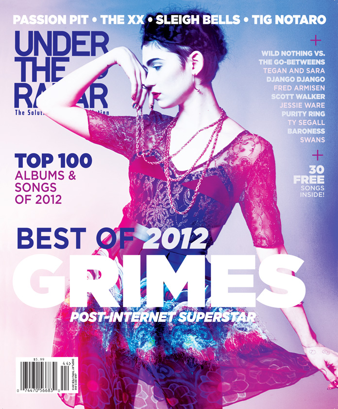
This flatplan is based off of Under The Radar

This magazine looks vibrant and exciting, which is how I want my magazine to look, thus, I'm mirroring what they've done. I've added two additional sell-lines as well just because they fit the curve of my image better.
I am putting the title central so that it catches attention straight away and is the clear focus of the page. I will also have my masthead behind my model so that it's clear who is the most important in the shot. 
My sellines should be short and snappy and I may be able to include more than one sellline in the boxes marked sell line. I will expiriment with this.
I want my product to be as bright and colourful as the image I am taking reference from.

Friday, 2 December 2016

Front Page Flat-plan (REVISED)

I like this flatplan a lot more. It does not have an actual base on any real magazine but I took inspiration from Under The Radar. This feels more professional and there's a lot more going on that would make it interesting. I listened to my survey results and decided to add in free gifts. The subimage down the left will be the posters that come with the magazine and the square blow that will have the text about the free posters. I also have more sell lines now which boasts that my magazine will have  more content which will help it sell and appeal. 
I based my title position off the of Under The Radar as they have a successful magazine and therefore I feel safe taking inspiration from them. 
The other sell lines have not taken the focus away from the main band as it still has the most room on the page with the enlarged band name at the bottom. Having it off centre creates visual interest. 
I will try to go for a red colour scheme once more and edit my photo so that the headphones on the photo are red whilst the body is B&W like I was initially planning on having on the contents page. 

Tuesday, 15 November 2016

Contents Page Flatplan REVISED

This is a lot more mature and less cluttered. 
It feels more clean than what I produced before and morel like a real product. I'm very happy with it. I will keep the red colour scheme because I think it's strong. 
The photo will still be the main focus although there is more of a focus on the text as well now because I don't want to infantilise my audience by completely relying on visuals and ignoring text.
 I will also include an editors note this time at the top of the page - so that it's separate from the main part of the contents page and doesn't disrupt that - and the editors note will bring a personal feel to the contents page and make it more relatable and personal to the reader.
I took some inspiration from Mojo 
Though, I have lowered the title down to add in the editors note. Still, I like the simplistic layout here and I feel as if it makes the image look very powerful and professional. 

Saturday, 29 October 2016

Contents Page Flat-plan

This flatplan is very exciting is full of interest.
 I think that it covers many conventions and will appeal to an audience because of the visual interest. The amount of subimages may be too many for a mature audience and could alienate older people - however, I will see how this looks when I fill this flatplan with the images
. It's very different from the minimalistic front cover but this will create contrast between the two pages and separate the two function of the pages.
 I will be going for a red colour scheme here and I will expiriment with less standard fonts on the page title - though the features section will only have standard fonts as I need it to be readable or it doesn't do it's job.
The photos that I use will be filtered and edited slightly. The photos will be the focus of the page instead of text to reflect my teen/young adult target audience as they are quite young and will prefer visuals over blocks of text.

Front Cover Flat-plan


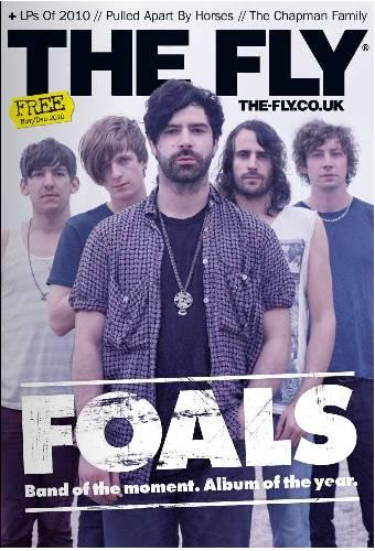
This is a very simplistic flatplan and I've based it from this image:

The Fly is a British Indie mag like my own and they were relatively popular. I feel as if the simplicity and minimalism is aesthetically pleasing and I could base my magazine around it.
This flatplan appeals to me because of the minimalism. I think it would stand out from its competitors because of its simple approach. It would look different clean amongst it's competitors crowded pages that are over-stuffed with content. I'm going to have the background white like done with The Fly (to further my attempt at minimalism.) The fonts I use will emphasise the minimalistic approach and they will be simple.